Is There An End In Sight For The Coronavirus Crisis?
By Brad McMillan
Things have quieted a bit (but only a bit) in terms of the coronavirus crisis. As such, I thought it would be a good time to provide an update on this evolving situation.
Let’s start with the trends in the spread of the virus to understand what they mean in the present for the markets, as well as in the future for the pandemic itself and the economy.
Growth Rate
Although we continue to see case counts rising, that rise is unavoidable at this stage of the pandemic and will continue for some time. Expect it—and don’t assume it means that things are getting worse. Right now, the metric that signals whether things are getting better or worse is how quickly, in percentage terms, the cases are growing. Here, the news is better.
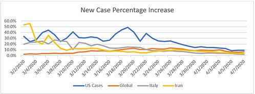
In the chart below, you can see that growth rates around the world are now at or below 10 percent. This number is not great. In fact, it implies that total cases will double in just over a week.
But to put things in perspective, it is substantially better than the 15 percent of a week ago here in the U.S. (which doubled cases every five days) and the 30 percent of a couple of weeks ago (which doubled cases in less than three days).

Another way to look at this chart is to view case growth as a representation of the steepness of the case growth curve. When we say “flattening the curve,” what we really mean is slowing the growth rate, which is just what we see above.
As growth rates decline, the curve gets flatter and the likelihood of overloading the health care system declines. Again, we are not out of the woods yet, but we are getting much closer. If current trends continue, we can reasonably expect to be turning the corner in the next month or so.
Confirmatory Testing
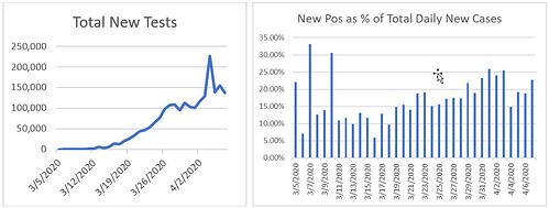
Other trends are positive as well. After a slow start, testing for the virus is now around 150,000 per day. There has been a slowdown in the growth rate in the past couple of days, but the testing rate should be poised to rise again in the next week. Again, it’s not where it should be, but it's much better than it was and likely to improve further.
Less good is the next chart, which shows the percentage of positive results on each day’s tests. The higher the positive results, the more the tests are being applied to confirm existing infections, rather than to find new infections or to establish population information to better manage the future control of the virus.
The initial spike at the end of last month seems to have been due to expansion of confirmatory testing in New York City, as that cluster of cases hit high growth rates. The current rise seems to be due to other cities that are now hitting the expansion phase.
We need greatly expanded testing to help determine population statistics; when the percentage of positive results gets back to the 10–15 percent range, it will be a good indicator that test availability is catching up with the need. That should come as the tests per day rise again, which takes us back to the first chart.

Headlines Ahead Of Themselves
These charts provide the underlying rationale for many of the current headlines, which are now speculating about peak virus and how the pandemic is being brought under control. As usual, the headlines are ahead of themselves.
We can see from the first chart that U.S. cases are still rising at 9 percent per day. So, cases will keep rising, and the new cases per day are set to double in the next eight days. Similarly, while testing availability is much better, it’s still not where it needs to be. Don’t get too excited by the headlines just yet.
The takeaway from the data so far is that we have made meaningful progress in controlling the virus: we know what to do, we are doing it, and it is working. We are, however, only about halfway through the process at best. If current trends persist, we are still several weeks away or more from seeing new infections drop to zero.
End In Sight?
The difference between now and the start of the pandemic is that we can at least see the end. We can see that we have flattened the curve, and we can reasonably project when the pandemic will be brought under control.
We are not at that point yet, but at least we can see it. And that is a very positive takeaway from the data thus far.
Brad McMillan is the chief investment officer at Commonwealth Financial Network, the nation’s largest privately held Registered Investment Adviser-broker/dealer. He is the primary spokesperson for Commonwealth’s investment divisions. He is also the author of Crash-Test Investing, a must-read primer for Main Street investors seeking to help insulate their portfolios against a market crash. This post originally appeared on The Independent Market Observer, a daily blog authored by Brad McMillan.


COVID-19 Health Care Costs Could Reach $556B Over 2 Years, AHIP Study Says
What COVID-19 Could Mean For The Insurance Sector
Advisor News
- Two lessons career changers wish they knew before starting the CFP journey
- Americans less confident about retirement as worries grow
- 6 in 10 Americans struggle with financial decisions
- Trump bets his tax cuts will please Las Vegas voters on his swing West
- Lifetime income is the missing link to global retirement security
More Advisor NewsAnnuity News
- Axonic Insurance Annuities, Built for Banks, Broker-Dealers and RIAs, Now Available through WealthVest.
- Allianz Life Adds New Accumulation-Focused Fixed Index Annuities
- Allianz Life adds new accumulation-focused FIAs
- Industry objects to ‘tone and tenor’ of draft NAIC Annuity Buyer’s Guide
- Annuity industry grapples with consolidation, innovation and planning shifts
More Annuity NewsHealth/Employee Benefits News
- Georgia Democrats decry steep drop in ACA enrollment
- Final roundup of new health bills from last days '26 General Assembly, including veto overrides
- Researcher from Chinese Academy of Medical Sciences Details New Studies and Findings in the Area of Cancer (Abstract LB247: Effects of health insurance on survival for five common cancers in China: A multicenter, hospital-based, retrospective …): Cancer
- How to make a high-deductible health plan work for you
- Attorney Richard House Joins Cody Allison & Associates, PLLC
More Health/Employee Benefits NewsLife Insurance News
- CMFG Life Insurance Company Trademark Application for “ADVANTEDGE ANALYTICS” Filed: CMFG Life Insurance Company
- AM Best Downgrades Credit Ratings of American Southern Group’s Members; Affirms Credit Ratings of Atlantic American Corporation and Bankers Fidelity Life Insurance Group’s Members
- Federated Insurance celebrates record-setting year at 122nd annual policyholders meeting
- Life insurance tips: 5 underwriting concerns for clients living abroad
- Prudential extends Japan sales ban another 6 months at a total $1B loss
More Life Insurance News