

What advisors must know about accessible client documents

Ask most financial advisors what they focus on improving, and you’ll hear about issues such as client acquisition, portfolio strategy or customer relationship management setup. Rarely does anyone mention document accessibility. That gap is important because the statements, disclosures and financial plans sent to clients are often the clearest signal of how much a firm respects the people it serves.
Many clients can’t fully use those documents, not because they’re careless readers but because the documents were never designed with them in mind. Older adults with reduced vision, clients with dyslexia, people who read English as a second language and screen reader users are not fringe groups; they’re in most client books right now.
What document accessibility means
When people hear accessibility, they usually picture large-print brochures or maybe a setting someone toggles in a PDF. The real picture is wider than that. An accessible client document delivers its full information to any reader, regardless of how they perceive, navigate or process content.
In practical terms, that involves several things that don’t always get attention:
» Screen readers follow a document’s underlying structure. If that structure is jumbled, the reading experience is too, even if the document looks organized visually.
» Charts and graphs are invisible to a screen reader unless a written description of what the data shows is embedded instead of using just a label.

» Color contrast between text and background must meet a minimum threshold. Gray on white and light blue on white, both common in financial documents, frequently fail.
» Headings built from bold text alone don’t register as headings to assistive technology. Only proper heading styles in the document structure work.
None of this is exotic. These are design decisions that are made or not made when documents are created. Under laws such as the Americans with Disabilities Act, firms that provide public-facing services are expected to make digital documents accessible to people with disabilities. For most financial firms, it has never been part of the conversation.
Where problems show up in day-to-day practice
The pattern repeats across most advisory practices, and firms rarely know it’s happening. Account statements, the most frequently sent documents, often have tables with no header rows, so a screen reader delivers a stream of numbers with no indication of what each column means. Charts ship with no written explanation. PDFs are produced from scanned paper, turning the entire document into an image that assistive technology can’t read at all.
Disclosure documents are drafted to satisfy regulatory requirements and limit liability, not to communicate with clients. The result is dense, heavily hedged and long enough that most clients stop reading. Financial plans lean so heavily on charts and projection graphs that a client using screen reader software may receive the key conclusions as a string of unlabeled numbers and axis values.
What must change
Fixing document accessibility doesn’t require a complete overhaul; it requires targeted changes to templates and writing habits and a commitment to checking before you send.
Step 1: Audit what you’re already sending
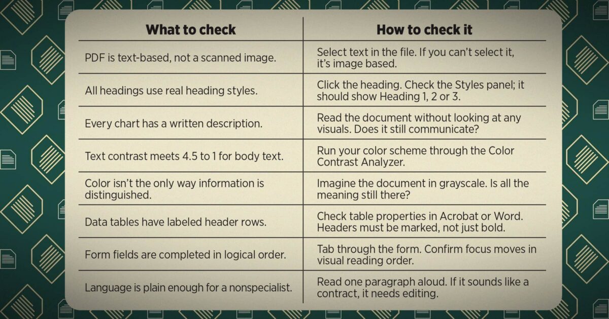
Grab the last statement, disclosure and financial plan that went out. Before touching anything, run through these checks.
» Can you select text in the PDF? Click and drag over any paragraph. If the text is not highlighted, the file is a scanned image and assistive technology cannot read any words.
» Do your headings use real styles? Click a section heading and check the Styles panel. It should say “Heading 1” or “Heading 2,” not “Normal” with bold applied. A screen reader reads past manually bolded text as if it were a regular sentence.
» Is every chart explained in writing? Cover each chart with your hand. If the surrounding text doesn’t explain what the visual shows, clients who can’t see it get nothing from that section.
» Can a nonspecialist follow the language? Read one paragraph of a disclosure aloud. If it sounds like a legal filing, it isn’t communicating, and a client who can’t follow what they signed hasn’t truly been informed.
Most firms find real problems in the first document they open. That’s the starting point.
Step 2: Fix the structure of your templates
Template fixes are a one-time investment that will improve every document produced from that point forward:
» Replace fake headings with real ones. In the Styles panel, apply Heading 1, 2 or 3 instead of Bold Normal text. This single change makes the entire document navigable by a screen reader.
» Add alt text to every image and chart placeholder. Right-click any chart in your template, select “Edit Alt Text” and write what the data actually shows. “Bar chart comparing portfolio returns” means nothing to a screen reader user. “Portfolio returned 6.2% in 2024, outperforming the benchmark by 1.4%” does.
» Mark header rows in every table. Select the top row of any data table, open “Table Properties” and check “Repeat as header row.” Without this, a screen reader reads a table as a flat list of values with no labels.
» Set a logical tab order for any form fields. Tab through every field in any fillable PDF or Word form. Focus should move from top to bottom, left to right, the way a sighted reader would read it. If it jumps unpredictably, keyboard-only users won’t be able to complete it.
Step 3: Rewrite for clarity, not coverage
The instinct in financial writing is to include everything and hedge everything. Plain language isn’t about reducing information; it’s about delivering it so it lands.
» Lead with what matters. Start with the conclusion or recommendation, then explain the reasoning. Most financial documents bury the point after two pages of context, and clients who have reading challenges won’t get there.
» Cut sentence length. Aim for an average of 20 words per sentence. Long sentences with multiple clauses are where comprehension breaks down fastest.
» Use the simpler word. “Use,” not “utilize.” “Help,” not “facilitate.” “Pay,” not “remit.” Every substitution lowers the cognitive load for every reader, not just those with disabilities.
» Define terms immediately. Define technical terms in the same sentence where they first appear, not in a back glossary most clients never reach.
Step 4: Check color and contrast before anything goes out
Color problems are invisible to someone with good color vision looking at a well-lit monitor. But those problems are not invisible to the clients experiencing them.
» Test your contrast ratio. The free Color Contrast Analyzer lets you click any two colors on screen and instantly check whether they meet the WCAG 4.5:1 ratio. Light gray (#888888) on white fails. Navy on white passes. Run it on your standard document colors once.
» Never use color as the only signal. If gains are green and losses red with no other difference, someone with red-green color blindness, roughly 8% of men, sees two identical columns. Adding a + or − sign fixes it entirely.
Making accessibility part of how the firm works
1. Assign ownership
Accessibility improvements don’t happen through good intentions alone. They happen when someone decides it’s a priority and assigns a process to it. Designate someone on your staff and make it their responsibility. Something that’s everyone’s job will become no one’s job.
Start small: Run your most-used templates through an accessibility checker, act on what fails and add accessibility expectations to your next vendor contract. Firms that need to go further can engage with financial document accessibility providers who handle complex or vendor-generated output that the firm can’t control directly.
2. Build basic knowledge across the team
Accessibility isn’t a technology problem that sits with one person; it touches everyone who produces what clients receive. An hour of training covering plain language basics, heading styles and how to run an accessibility check in Word or Acrobat is enough to reduce common mistakes. It pays back quickly in fewer documents that need to be explained twice.
3. Communication quality is a competitive differentiator
Clients who can read and follow their documents tend to feel more confident in their advisor, come into meetings better prepared and are more likely to give referrals. In a market where investment performance numbers across firms are often close, communication quality is one of the few real differentiators.
Most financial firms have produced documents the same way for years, and accessibility has never been part of that process. It makes less sense to continue that way now, when clients expect more, regulators are looking more closely, and the tools to improve things are readily available and often free.
What’s required isn’t a redesign of everything — it’s a decision to look at what’s going out and ask whether it works for everyone receiving it. Pull up a client document right now. There’s probably something in there that doesn’t work as well as you thought it would. That’s where you start.



The framework that builds excellence
The rise in crowdfunding: A symptom of the coverage gap
Advisor News
- CT governor’s candidates claims: What’s true, and what’s misleading
- Retaining clients by giving them a memorable experience
- Addressing the longevity paradox
- Employers shift focus from retirement access to financial outcomes
- Helping widowed clients navigate their new financial reality
More Advisor NewsAnnuity News
- Farm Bureau P&C insurers post first underwriting gain since 2021
- Legacy Marketing, Malibu Life launch two fixed indexed annuities
- Changing client priorities are reshaping annuity conversations
- Solen Software acquires annuity software provider Cooperative Technologies
- MassMutual Expands Lending Options With New Secured Credit Line
More Annuity NewsHealth/Employee Benefits News
- Centene sues feds over low ratings for senior health plans
- Terry Savage: Small business owners, now is the time to offer health insurance coverage
- Aldermen select employee medical insurance broker services provider
- Southwest Bridge Health focusing on insurance coverage gap in Berrien County
- HEALTHCARE SHOULDN'T REQUIRE A MAP
More Health/Employee Benefits NewsLife Insurance News